Atarashi Games School Uniform Contest!
January 5, 2010

Contest: Design a school uniform for the student characters of Panty Explosion, Classroom Deathmatch and other Atarashi Games rpgs! We’re looking for a single high school uniform we can use in all of our Japanese high school themed games. This is your chance to design an iconic uniform that will be worn by the characters in every Atarashi Games rpg!
You don’t have to be a great artist to enter this contest. We’re looking for a great design, not necessarily a great drawing. All you need to do is come up with the best school uniform design you can! Use pencils, pens, MSpaint or whatever tools you’re comfortable with!
While we’re mainly looking for a basic uniform for female students, feel free to include summer and winter variants of the uniform, gym uniforms, school swimsuits and anything else you can think of. And don’t forget the boys!
What makes a good uniform? That’s for you to decide! We’re looking for something kind of along the lines of the traditional sailor seifuku, but feel free to go nuts and take your design in a different direction! A neo-military look, a semi-futuristic uniform or something a little sexy might look just as good as a really nice traditional design. Remember, we make games about psychics that blow peoples heads up, so don’t feel like you can’t submit a design that’s just completely bat shit insane.
Here are the contest requirements:
– Create a school uniform design!
– Send it as a digital file to Jake Richmond at Jake@atarashigames.com
– The deadline is February 27th, 2010. Get to work!
– Check out the official contest thread and as well as some uniforms I like from different anime, manga and films at GoPlayPDX.com!
The prize:
-All submissions will be featured in a special gallery at Atarashigames.com.
-The winning submission will be used in every Japanese high school rpg published by Atarashi Games, including the new versions of Panty Explosion (available later this year) and Classroom Deathmatch!
-The creator of the winning submission will be credited in each Atarashi Games rpg where their design appears, and will receive complimentary copies of those products in both PDF and book form.
– That’s it. If we meet in person I’ll also buy you a drink and give you a big high-five!
Thanks for participating. I’m looking forward to seeing what you come up with!
Jake Richmond
atarashigames.com
Work in Progress moves!
March 8, 2007
Work in Progress has a new home! I’ve moved the Work in Progress blog over to Livejournal. You can see Work in Progres 2 here. from now on I’ll only be updating the new site.
Why move? Am I abandoning WordPress? Nope. I love WordPress! WordPress is still the home of the Atarashi Games blog and my freelance gallery. But I decided that I wanted to be on Livejournal, and it’s easier to move Work in Progress then either of the other two.
The good news is I’ll be posting a lot more. In the past I’ve largely limited my posts here to talking about freelance stuff. the new Work in Progress will cover not just my freelance work but also my games, my comics and anything else I’m working on. I ant it to be a home base for everything I do.
And yes, I am aware that no one actually reads this and I’m talking to myself.
Jake
The SUPER END OF 2006 ART DUMP SHOWDOWN (SPECIAL EDITION!)
January 5, 2007
The last few months have been busy, and I’ve neglected my blogging even more then usual. here’s what I’ve been up to.
Gun Mage
I’m working on a new game called Gun Mage with Travis Brown. We did the CrossRoads of Eternity together a few years ago, and it’s nice to be able to work with him on a new project. Gun Mage is working it’s way out of being a rough draft and into something that we can start play testing. This is the first bit of art I’ve done for the project (which I am also co-writing).

The Year We All Died
Before Gun Mage see’s the light of day I’ll have my new game, The Year We All Died complete. TYWAD is a love story set against a war that ends the world. The game is for 2 or more players and played through remote communication (over the phone, through letters, emails, chat rooms, etc). Bucking RPG traditions, I’m illustrating the book using manga pages. So the book will be half manga, half rpg. Here’s a few panels of line art from the project.

Urban Fairy
One of 2 color illustrations I did for Nate Peterson’s new game. I’m looking forward to playing it.

D&D Monsters
I recently finished a bunch of illustrations for someones new D&D monster book. This project was a lot of fun. I could probably draw crazy D&D monsters for the next 2 years and not get tired of it.

Fastlane
I’ve been working on a new cover for Alex Cherry’s fantastic indie game for a few months now. We’ve been having trouble finding a concept that works, but I think we’ll have something soon. Hee’s the most recent really rough sketch.

The Fall of Pilaeus
The Baeg Tobar Webcomic I do with Joseph Wise and Chris Summers is still going strong. We’re 20 pages into it now. We’re taking the month off to get a bit ahead. Here are my pencils for the page that should be up after the break.

CLASSROOM DEATHMATCH!
Here’s the big thing. Classroom Deathmatch is the follow up book to Panty Explosion! Classroom Deathmatch is a stand alone game using the Panty explosion rules to pit Students against each other in a battle to the death! It’s very close to being finished and should be available in late Feb. It will be out before both Gun Mage and The Year We All Died. Here’s some art. look for more soon at the Panty Explosion site!

New art
December 1, 2006
Here’s the first bit of concept art for what will probably be my next game. More details soonish.

Two of my favorite things.
October 25, 2006
Peole who I owe work to may not be pleased to hear that I took the vening off and spent some time drawing just for fun. Here’s the result. I’ve decided to use it as a Panty Explosion wallpaper. You can get the full sized version at the Panty explosion site here.

Cycles site launches!
October 20, 2006
Hi! The Cycles site is live! Check it out here!This is the big project Sebastien Pelletier has been working on forever, and I’ve been drawing for about a year. The site is opening with a teaser of the Avalanche storyline which features about 30 of my illustrations. It’s pretty cool. There are a lot of really talented people working on this, so you should really check it out. You can also check out Sebastiens recent Forge thread on promoting this project. See it here. Give the man some feedback. He’s working really hard to bring something really cool into the world.
Oh, here’s some art from the project:

Oh shit, I think I need to update my blog!
October 17, 2006
Time flies. Gencon came and went and lfe has been difficult. here’s some of what I’ve been working on.
Fall of Pileaus (FoP): The Baeg Tobar web comic that I’ve been working on is now live. Check it out here. The story is by Joseph Wise. I was really not looking to work on a regular web comic, but Joseph has come up with just the kind of political suspense fantasy story I really dig. I couldn’t help myself. Chris Summers is coloring directly over my pencils and is doing a fantastic job of making me look really, really good. Jason Hanley is doing a fine job on the letters as well. We’re updating every Weds, and theres 4 or 5 pages up already. Here are some of my character sketches for the series, as well as my pencil drawing from the cover. I don’t think these have been put up anywhere else yet.


Cycle (the French Job 2): I’ve finally finished the second part of this multi-part job for Sebastien. My illness from the summer and some other problems caused this one to be pretty late. Way back when I finished the first part in April I promised I’d start the second part right away. And I did. Anyway, it’s done now, and i’m fairly pleased with it. This job consisted of 27 full color illustrations. Here’s a few:


The Cycles site should be going live tomorrow. I’ll post a link to the site as soon as Sebastien tells me I can.
Sci-Fi art for Rebel Minis: I’ve done a whole mess of sci-fi art for Rebel Minis, some of which should be seeing publication soon. Rebel has continued to be one of my favorite and most reliable clients. I’ve worked on about a dozen projects for them this year and they always pay on time. Plus the work continues to be interesting.

Recent work for rebel has included the box art for their Templars squad (above), designs for space dwarves, a Hover Tank Commander logo and a few damage chart illustrations. It’s fun stuff. I almost never get paid to draw sci-fi stuff, so I’m really enjoying it. I’m doing a nother peice of Hovertank art for them this week, so I’ll post that when it’s finished.
Neo Productions : I did a few illustrations forNate Petersens new card game. The project has been put on hold for now, but I’m just about to start another project for Nate instead. here’s one of the creature designs (based on Nates notes) from the card game. I’m looking forward to continuing this eventually.

Fastlane Cover: I’ve been working on a cover for the new edition of Alex Cherry’s Fastlane for about 2 months now. I’ve had a lot of trouble coming up with a good design, but I think we’re getting close. I’m sending him new sketches this week. I hope we can finish this project before the end of the month.
Crossroads Omnibus 2: Travis Brown and I finally finished the 2nd issue of the CrossRoads Omnibus. We’ve had it finished since August, but as of this writing it hasn’t been released. I’ve been swamped with work and things have been just as bad for Trav. I think we’ll have it available for sale as a PDF by the end of the month. Look for it on the CrossRoads site as well as RPGNOW and Key20. Here’s the cover and one of the interior illustrations from the issue. i did a lot of nice art for this issue, and wrote what I think is a very good feature on werewolves that includes new rules for werewolves, as well as rules for playing lycanthrope characters. If you play CrossRoads you should definetly pick this issue up.


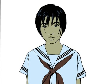
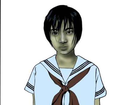
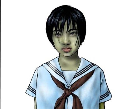
Panty Explosion: Hey, Panty Explosion is doing pretty well. No, really. The book was released to some nice reviews and we sold out our initial print run pretty quick. New books are being printed as we speak, and will be available from your local store (if they bothered to order any) by the end of the month. With the book going back to press I took the opprotunity to do some new art. I never got a chance (because of my illness) to do all the illustrations I wanted for the book. The new version contains 2 new illustrations. One of them is below. You can check out the other at the Panty Explosion site. Its available as a downloadable wallpaper.

New Games: I’ve got a few new games I’m working on. Travis Brown and I are developing a fantasy game called Gunmage and Gabe Sutherland and I are working on a survival horror game called I AM A SURVIVOR. Both are comong along well. Before the end of the year Matt Schlotte and I will release Classroom Deathmatch, a suppliment to Panty Explosion. My brother Nick Smith is working with us on this project and it should be awsome. We’ve been playing Classroom Deathmatch here at the house for a few weeks and it kicks major ass. I’ll put playtest rules for Classroom Deathmatch up on the Panty Explosion site by the end of the month (maybe on Halloween).
There’s a few other jobs I’m working on as well, but I’ll wait to talk about those till later this week maybe. Here’s some other stuff I want to mention first.
Rackham is screwing over its customers and fans: Rackham makes the really fun games Confrontation and Rag and the excellent line of miniatures that go with them. Recently Rackham announced that they would be making changes to both games. None (or very few) of us that play these games are happy with the changes. In the case of Confrontation they are simply messing with a game that did not need to be messed with, and this only a year after releasing an expensive new rule book . In the case of Rag (which I play much more then Con) the proposed changes do not address any of the games exsisting problems and instead create a number of new ones.
These changes are just the latest in a series of screws that Rackham is passing onto its customers. Recent blatent and shameful price hikes were just the tip of the iceberg. Rackham has started repackaging old miniatures in more expensive boxed sets, has in many cases decreased the numer of miniatures that come in boxes (while raising the price) and have stopped doing business with a long time fan favorite distributor. You can read a bit about the recent problems on Rackhams own forum here. If you like Rackham or its games I would encourage you to get on the forums and complain loudly that you do not like the direction the company is taking. I’ve said this before, but the message was not well recieved by the Rackham fan community, who claim to prefer to “vote with their money”. That won’t work this time. If you want to keep Rackham from becoming an evil empire then you must complain loudly and complain often.
My top 10 Video Games: I want to post a list of my top 10 games from this most recent generation (PS2, XBOX, Gamecube) . Why? I don’t know. I just want to. So, in no real order:
Jet Set Radio Future (XBOX): Brilliant. Graphics, controls, music, character and level designs.This game is just astoundingly good. A lot of people dismiss it as a kids game, a sports game or a music game, but what it is is a solid adventure game in the spirit of Zelda and Megaman.
Final Fantasy X (PS2) A stunningly well produced game that set the bar for every other RPG of this generation.
Metal Gear Solid 2 (PS2) Such an amazing production. Such a well made and well executed game. Was the story difficult to follow. No. You weren’t paying attention. Play it againand don’t skip the cut scenes this time.
Metal Gear Solid 3 (PS2) Of course the third one is better.
Halo (XBOX) Not the awful Halo 2, but the excellent first game. Deathmatch was fantastic and well balanced, but it was the astounding co-op story mode that put this game on my top 10.
Silent Hill 2 (PS2) I enjoyed 3 and, but 2 was just leaps and bounds beyond. Not only is this game actually shit fuck scary, but it has a fantastic story and really, really nice visuals and sound. yes the controls suck. I know. The games so good that it makes the top 10 despite that.
Dynasty warriors 3 (PS2) yes. Really. Everybody likes to give Koei shit for making the same game 12 times in a row. Fine. DW3 is amazing. The missions are well designed, the characters are cool and the controls are awsome. between Matt, Travis, Andres, Nick Jeremy and myself we must have played this game for 3000 hours. Tons of shit to unlock, tons of extra missions. Multiple campaigns that are actually fun and challenging. yes the voice acting is bad. Who cares when you can kill 3000 Yellow Turbans?
.Hack/Whatever (PS2) I love this. I love the concept. I could play this forever. I can’t waitfor the new one.
Shadow of the Colossus (PS2) Stunning. Maybe the most stunning game I’ve ever played. The amount of depth, emotion and beauty in this game is simply staggering. And it plays like a dream.
Ico (PS2) Also, beautiful. Also stunning. This game is just full of amazing moments.
Anway, because we’re talking about games I’ll go ahead and put up a picture of a character from my comic Perfect Drug dressed as Snake from MGS3. Enjoy.

Panty Expolosion Now Available!
July 25, 2006
The Atarashi Games Online Store is now live! This means Panty Explosion is now officially for sale! You can now purchase the downloadable PDF from our store. Expect to see the print copy of Panty Explosion for sale early next month. Check out the official Panty Explosion Website for more info.
This is exciting shit!
-Jake
Gencon!
July 21, 2006
I’ll be at Gencon this August. I didn’t have the money to go but good friend, housemate and landlord Barry Deutsh decided to sponsor my trip. So please, please feel free to contact Barry and tell him thanks on my behalf by visiting his site here http://www.amptoons.com/. I’m looking forward to actually meeting many of the people I’ve worked with over the last year. if you want to get together at the show please let me know and we’ll try to schedule something. In the Work in Progress spirit I’ll be bringing my current portfolio and trolling for work. Beware.
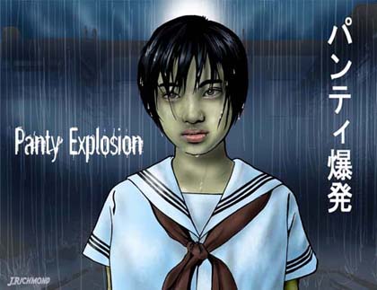
The Panty Explosion Cover
July 15, 2006
As promised, here’s a description of the process that went ino the Panty Explosion cover.
Step 1: The line drawing I used to work on a comic called “20 People are about to Die” where I used a very similar approach to the line drawing. The idea is to leave out all the extraneous lines, focus on the heavy blacks and only draw what you think you would actually see. On the comic all of my characters were based on actual people (myself, Travis Brown, Matt Schlotte and others) and I found I could get a remarkable likeness through this process. Here’s an illustration of myself from the comic, re-purposed as my portrait over at ERS
 Jake (I don’t actually have yellow eyes).
Anyway, I don’t often use the process, mostly because I don’t like drawing actual people. But I decided to revisit the style for PE, and I’m fairly happy with how it turned out. As you can see the line art for this drawing is amazingly simple, with minimal attention given to detail and stylized hair. This may be misleading because my blue pencil drawing that I inked over was horribly complex and messy. it took several tries to get the shape of the fave, the placement of the eyes and the line of the hair right. I gave up on the lips and opted instead for a simpler suggestion of the mouth.
I should mention that even before I started the drawing I knew \exactly what I had wanted it to look like. Back around the time Matt and I had started talking about the game I had seen a clip from a Korean music video where a young student was walking through the rain. She looked soaked, miserable and unsettling, and I thought that was a strong image for this game. At the line art stage I decided not to add in the background, rain o drops of moisture on her skin. I’d wait for later with that. her’s what the line art looked like after i filled in the initial colors.
Step 2: color: I scanned the line art into Photoshop and started the coloring process. As you can see above I selected just 4 simple colors to act as the base of the illustration. Even though I wanted the uniform to be white I decided to color it a light blue because the girl was standing in the rain at night. Similarly, the kerchief received a very dark shade of red. I went back and forth on the skin tone forever. I had compiled an impressive number of photos of wet looking miserable people (thank god for hurricane Katrina), but it took me forever to find a skin tone that looked right, and I had several false starts. On about the fifth try I convinced myself that the skin tone needed to benefit from the same darker shade I had given the uniform. As soon as I applied the color it just clicked. I was a kind of sickly greenish brown that was just perfect for wat i was doing.
Now that my colors were assigned I had to move onto the daunting task of actually drawing the characters face. I’ve never done color work on this style of illustration before. I knew I wanted this piece to have a more realistic look then, say, the Six-Gun Assassins cover I did a few months ago (you can see that below), but I wasn’t really sure how to accomplish that. In the sketch stage I had rendered the characters face in as much detail as possible, so I referenced that for the color stage. I decided I would use a combination of different paint brushes as well as the burn and dodge tool to build up her facial structure. This took several tries and I wasn’t happy with many of the results. I started over a few times but after awhile I decided to just paint over my mistakes. This started to give her face a texture that I really liked, and I built this up for awhile. I also used a custom brush to add in some other texture and give her face a rougher look. at first I thought this was too rough, but after going over the face with a 30% opaque paintbrush I achieved the look I wanted for the skin.
The eyes were a bit of a challenge. I decided right of the bat to change the whites of the eye to a darker grayish-green to match the color tones of the rest of the illustration. But the eyes still looked dead to me. I thought about adding some tears but decided that wasn’t quite what I wanted for the illustration. I instead opted to give the character swollen, reddish eyes that would make her look like maybe she had been crying. The results were a little more then I had wanted, but once I toned them down they looked quite good and really lent to the miserable and spooky look that I had hoped to cultivate. At this stage I had also colored the neck but hadn’t gotten around to the arms. I also hadn’t decided what to do with her mouth. You can see the results below.
Step 3: More color: I had most of the face where I wanted it, but the fucking mouth was vexing me. I wanted to avoid over doing the lips because I was afraid the character would look silly, or worse, attractive. The girl was supposed to be miserable and unsettling, and while she is an attractive girl, I didn’t want her to look sexy. While I debated over the lips I went ahead and colored the uniform and arms. This was cake compared to the face. Shading the uniform in the same way I did the face gave it a nice texture that to me implied damp cloth. I spent a little time picking out some deeper shadows on the uniforms right side and lightening the rights side just a bit.
I had avoided the lips for long enough and decided to jump right back in. I got it on the first try. I used a fainter version of the same red I had used on the kerchief to give the lips their color and shape. After that I spent awhile shading them with the burn and dodge tools and the paint brush. The results were pretty good, although I ended up going back a little later and toning down the lip color even more and using the paint brush to add some moisture to the top of the upper lip and the left side of the lower. Here’s the illustration as it looked at this point.
Step 4: everything else: I cheated on the background, using a daytime photo of an Idaho middle-school. II used photoshop to grey-scale the photo, and increased its contrast till all I was left with was the black, shadowy parts of the building. I filed in this shadowy suggestion of a school with dark blue, and then shaded it till it was nearly black. I used the paint brush tool to draw a moon and some dark clouds peeking over the building and the rain as well.
Once I finished the background I pasted it to a separate file (and promptly accidentally deleted the original) and pasted the girl on top of it. Now came the important part. i carefully added drops of moisture to the girls hair using the paint brush. i over did it a bit and ended up erasing about half of them. I then added the moisture to the lips as mentioned before. I did the same to several other parts of the face, and also added a drop of water to the chin and a trickle of water running down the characters neck. Using a 93% opaque brush I added a little bit of pale green to the right side of her chin and jaw and a few other places on her face. I stopped for dinner (at 4am) and when I cam back I realized I was already finished. You can see the finished illustration below.
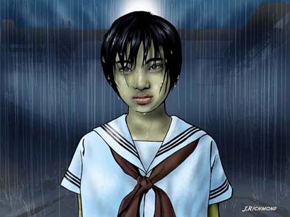
Overall I’m very pleased with how the image turned out. I think it does a good job of capyuring the feel of the game. Here’s a look at the image complete with text, used for the promotional postcard that we’ll be handing out.